Exciting news! Our ConnectBooster Support documentation is moving to a new location. Be sure to bookmark the new link below.
This is where you set your customer portal color theme, changing it's look & feel. You can supply custom color HEX codes and several logo choices to help organizations recognize your brand.
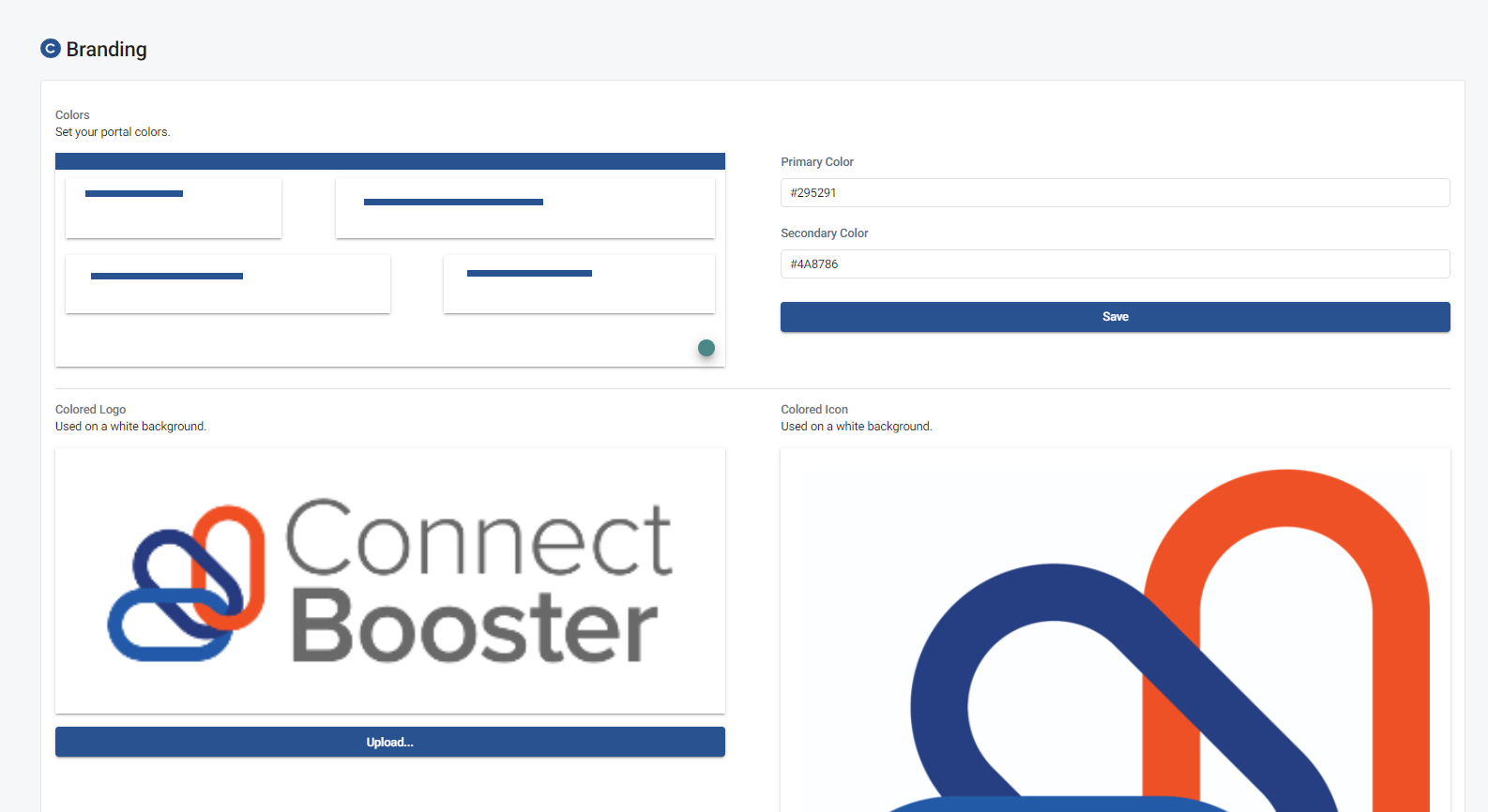
Colors
- You can set a primary and secondary color here. The inputs both accept a hex color value. We recommend colors that are well saturated and darker than #cccccc as white text and logos are placed in areas where these colors are used as a background. These colors may also be used in text on white backgrounds.
Colored Logo
- This is the primary logo when the background is not colored (set to white).
White Logo
- This logo doesn’t need to be white, but it is recommended. This logo is placed anywhere a logo is used with a colored background. The preview of this option is placed on your currently selected primary color.
Colored Icon / White Icon
- These follow the above rules, except on specific smaller screen sizes. Both are completely optional as they will fallback to the like version of your full logo.
Favicon
- Setting a Favicon within the branding section will further help to brand your portal by displaying it within your browser tab.